X-Sight Keyboard
Redesign a product to fit the needs of a visually impaired person. How may these needs be met and still meet universal standards for use?
Materials: Adobe Illustrator, Adobe Photoshop, Rhino | Wood, PLA Filement, Metal
Time frame: 2 Weeks, Fall 2021
Class: Sophmore Fall, Design Principles 1
Mentor: Leslie Fontana
What is the hierarchy of needs for a human being once sight is eliminated? How can a user create a bond with a product? What relationships do we share with sound?
Step 1: Understanding the original product
The orthographic depiction of the Casio PT-10 Keyboard was created on Adobe Illustrator, as was the operational sequence poster. The figure above was mocked up in Rhino. These graphics give an insight into how the original product was used and how it moves in space.
Step 2: Create an Exploded-view model to understand the internal components
The exploded view drawing was done in Adobe Illustrator. The exploded view model was created using dissembled keyboard parts and plexiglass. These models assist the designer in creating new forms that would still be able to fit the internal components of the original product design. This step informs the rest of the design process.
Step 3: Iterate
Model 1:
For this model I created a keyboard design with virtually zero sight-base interface. Octaves are changed by pressing the left/right-most keys, and all other “toy-like” features are stripped.
Model 2:
This model was based upon the tilt, shape, and positioning of the human hand and arm. The keyboard interface is sloped to allow more comfortable and Practical hand positioning. There is a scroll wheel on the left and right sides of the keyboard giving a tatile feel to the user and enabling them to switch octaves with ease.
Model 3:
This design comes with an attachable, plush base unit that fits snuggly in between the users legs. This gives a strong sense of security and balance.
Model 4:
This keyboard design is based off of the “Rolli Seaboard” keyboard design. There are no black or white keys, only a pad allowing for touch and feel to take over rather than sight and other visual cues.
Model 5:
For this model, I kept the toy/kiddish aspect of the original product. I included three big buttons to control volume, power, and tap metronome. Minimal buttons allows for less memorization necessary by the user and thus ease of use.
Step 4: Final Design
This redesign is meant to fit the lifestyles and preferences of a visually impaired user. The final rendered design features two outward facing speaker to project more sound. Ergonomic base indentations make it easy for the keyboard to sit flat and tight on the users lap. Chamfered keys capture the finger as it is about to play a note, and guides the finger to the center of the key with great accuracy and spherical braille indentations mark each octave on the keyboard. As for the buttons, there are two concave octave up/down buttons on either side of the keyboard allowing for easy access while playing. The volume wheel and power button sit in the middle of the top face of the keyboard and act as the only buttons on that plane, erasing the requirement of memorization.
Step 5: Final Product Mock-Up, X-Sight
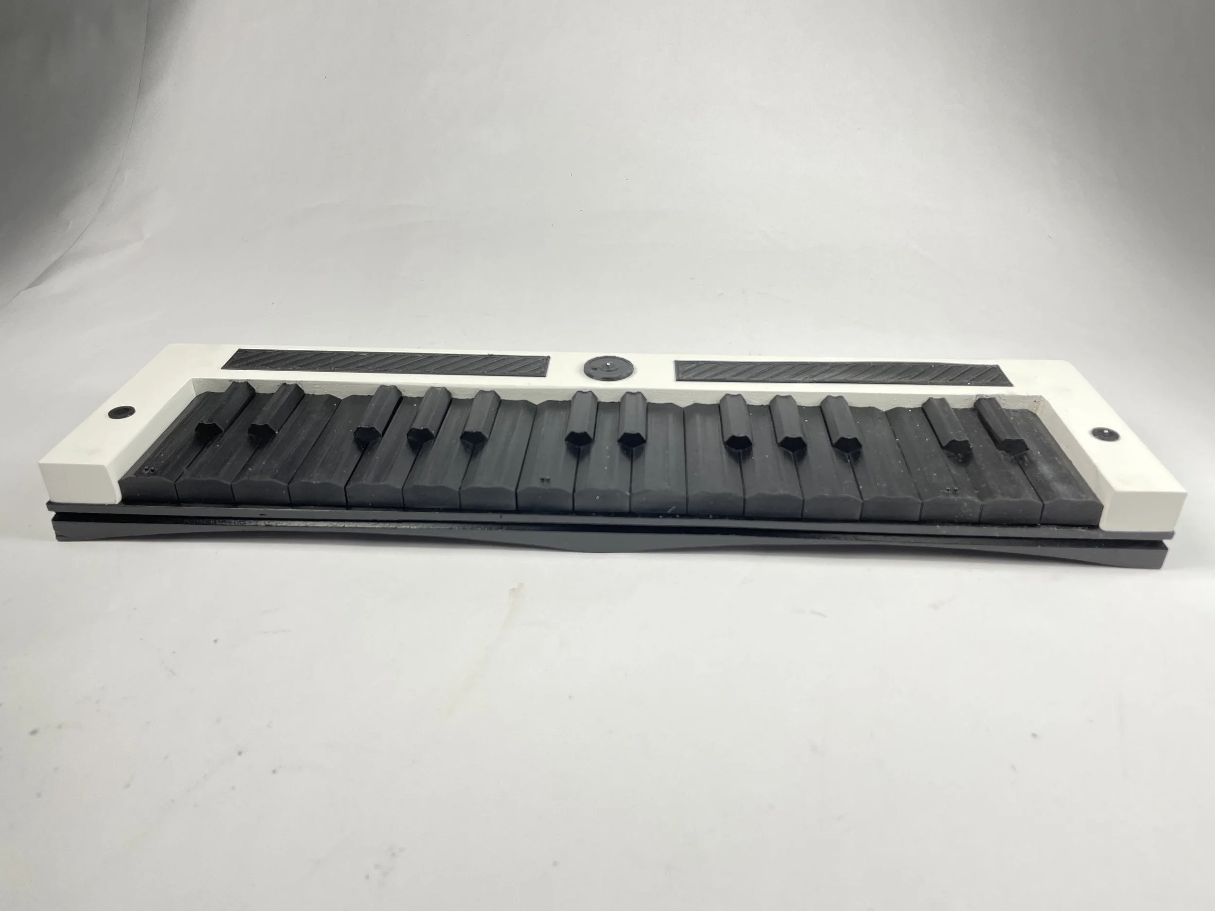
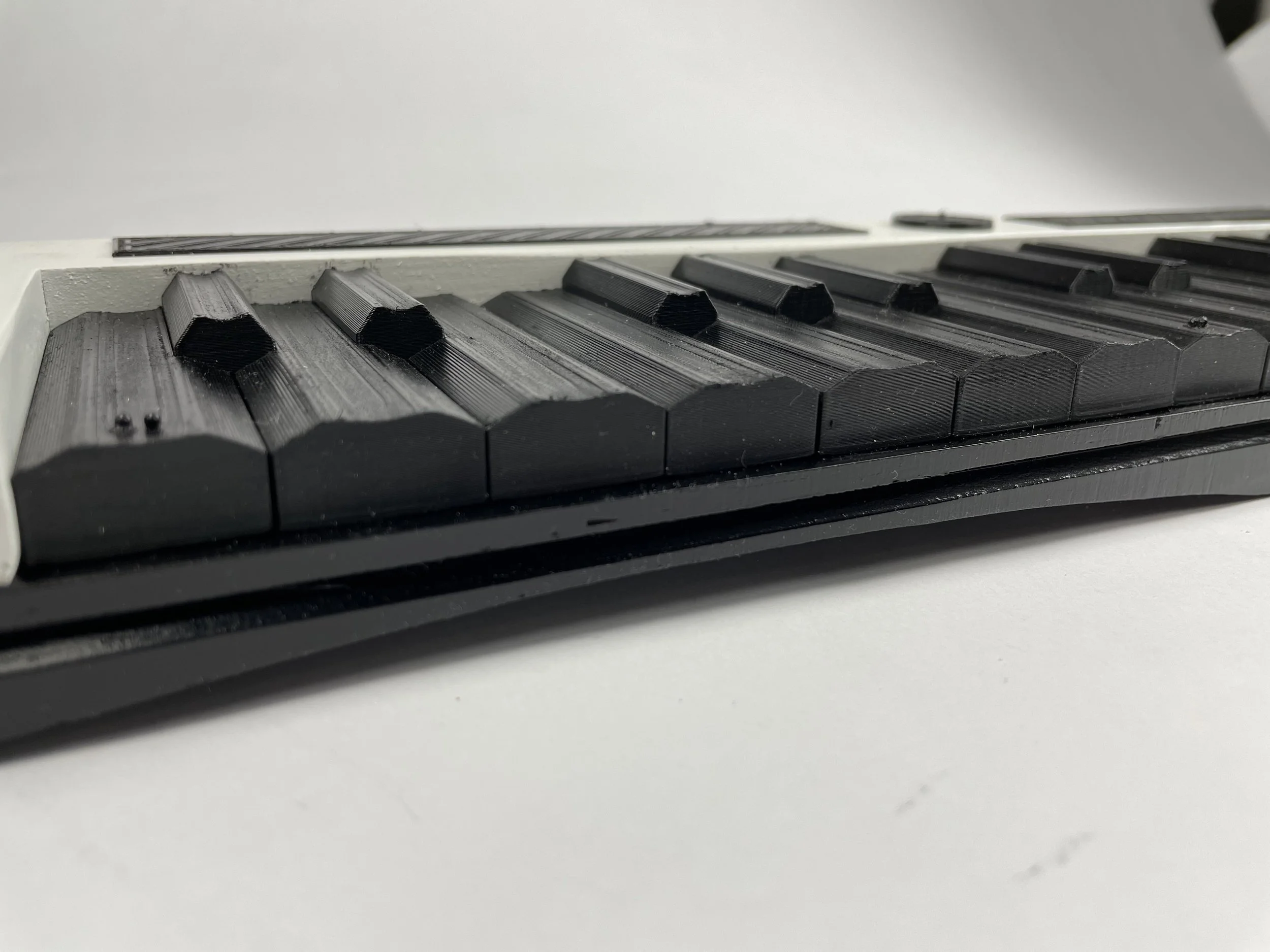
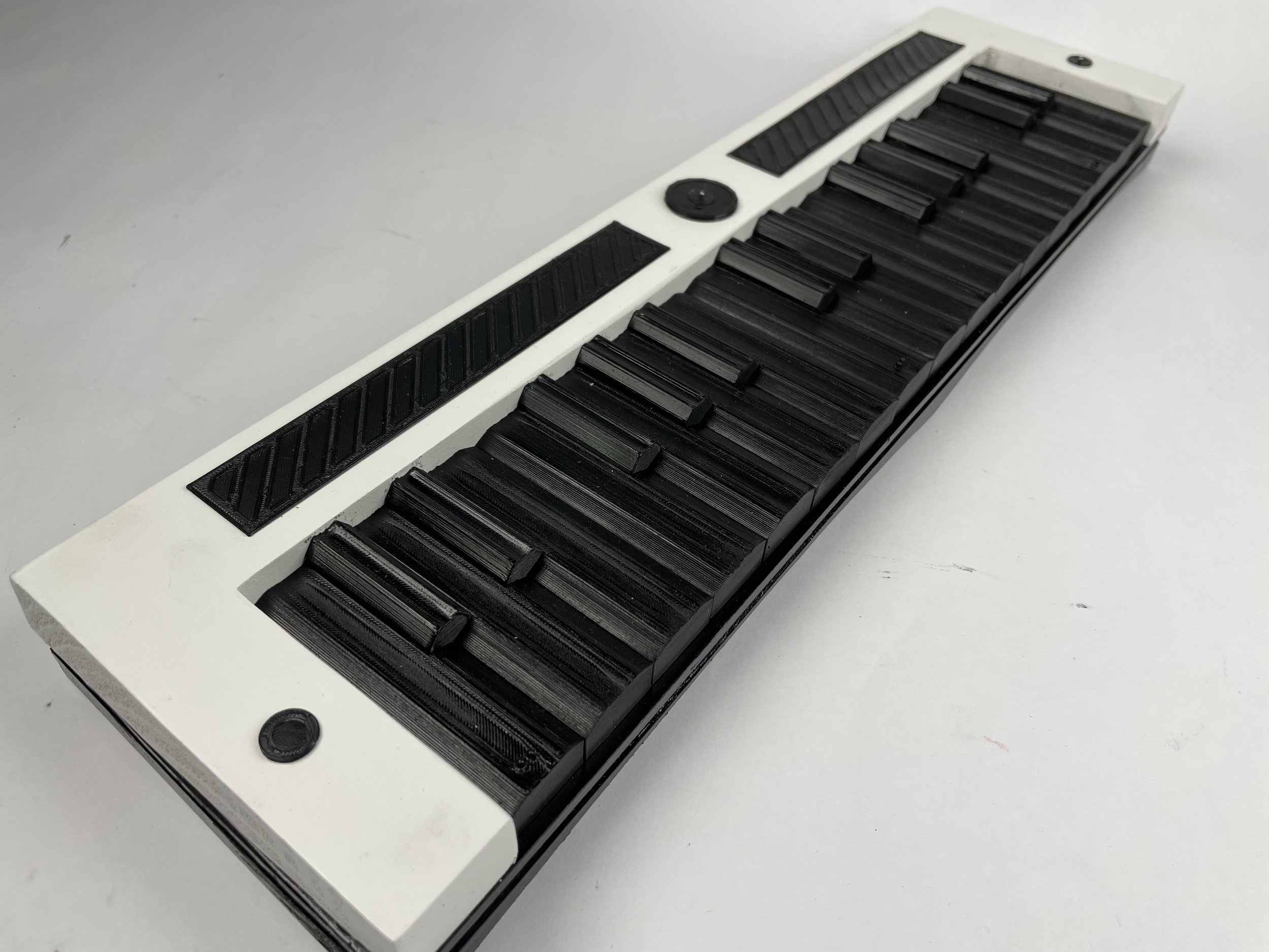
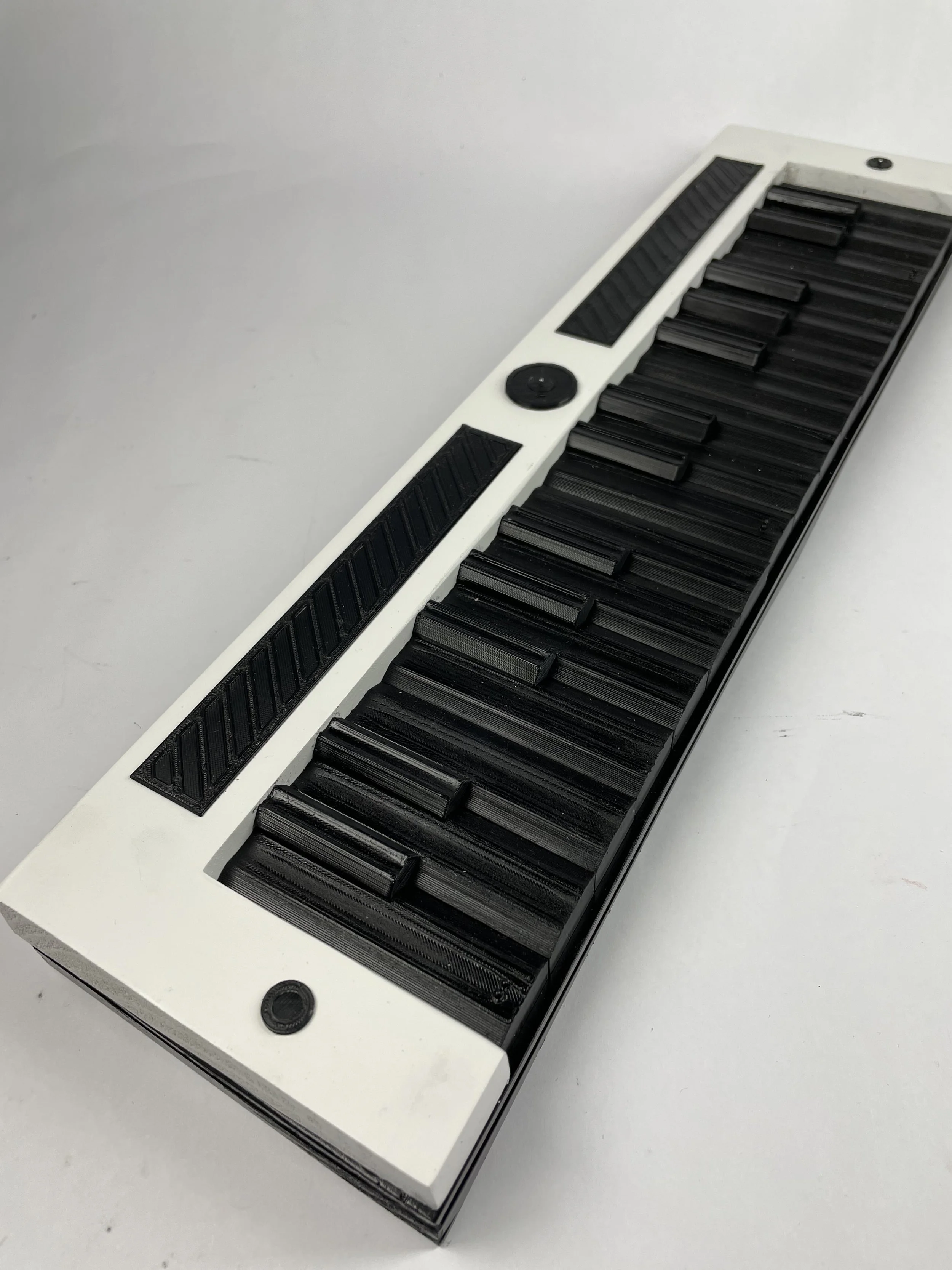
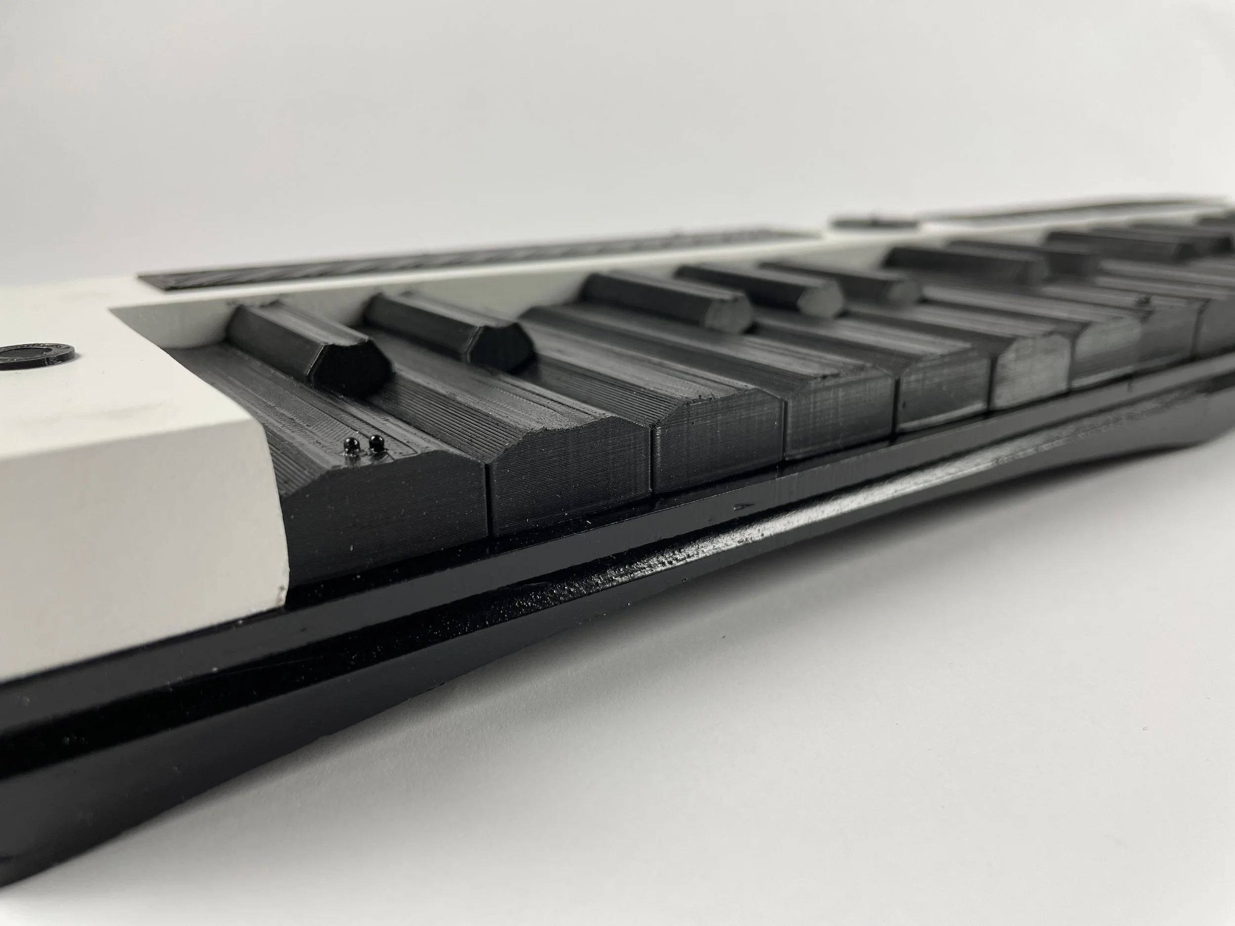
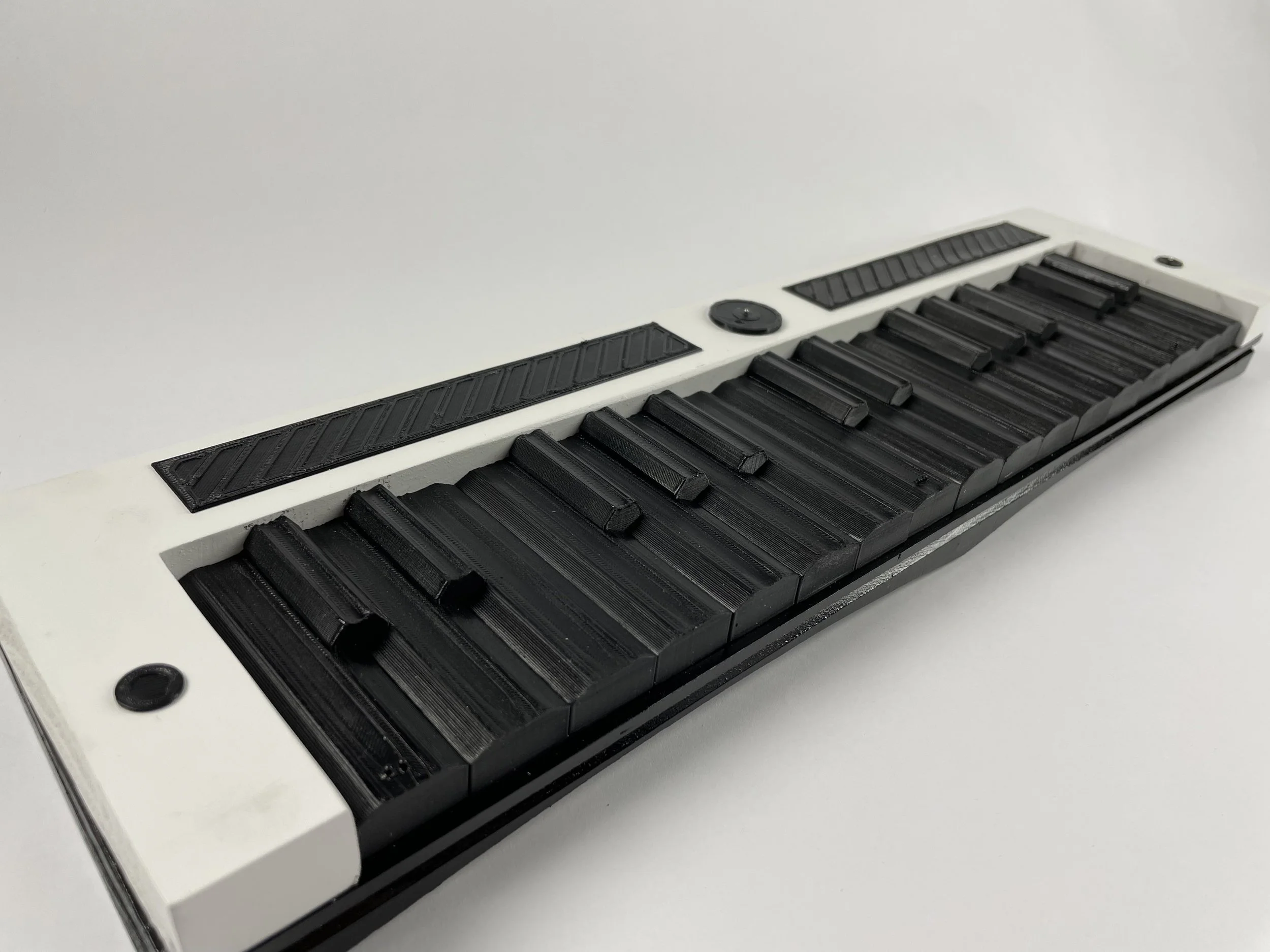
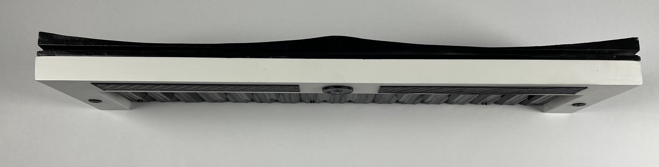
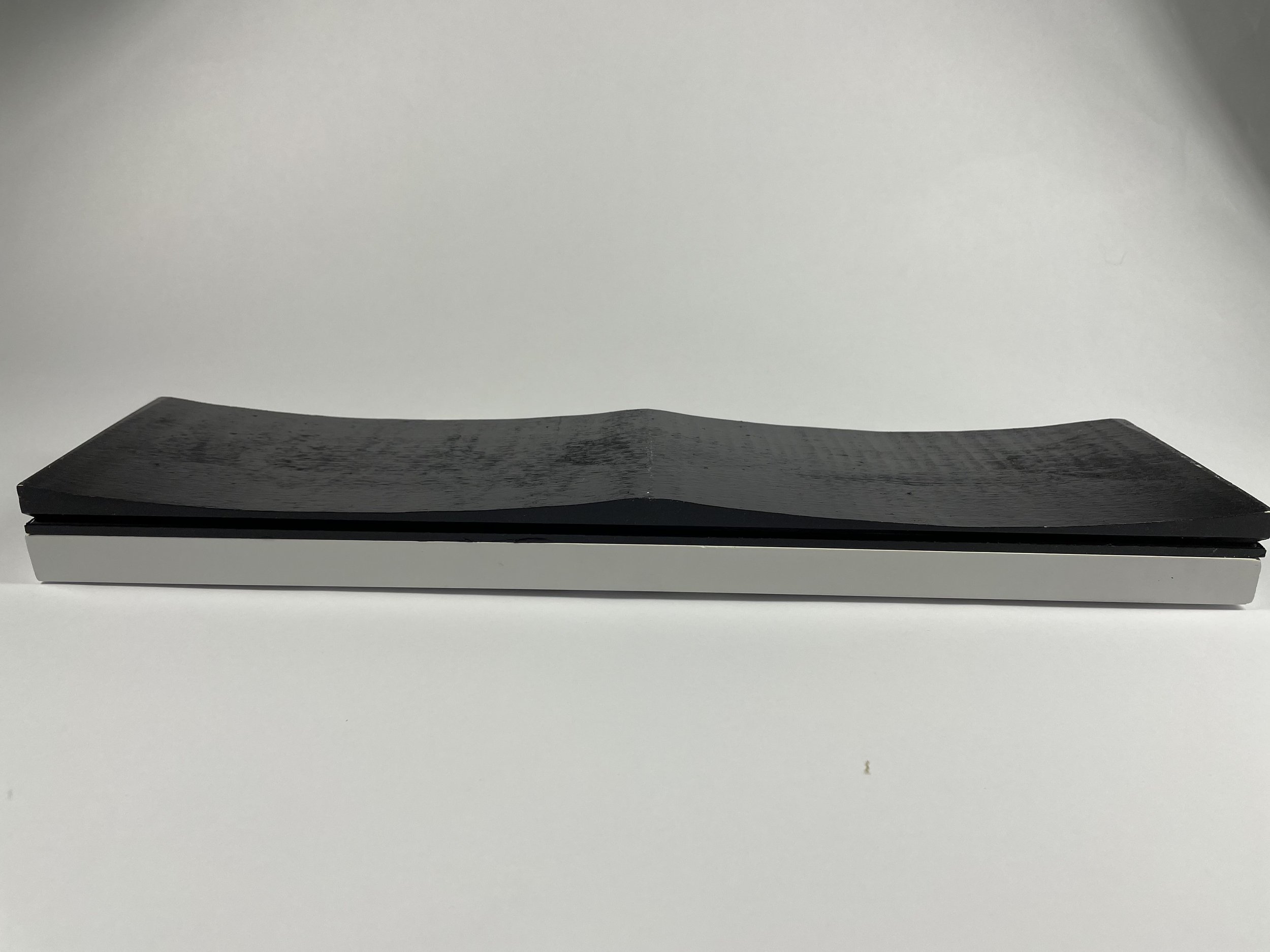
The X-Sight was constructed using wood shaped on the ban saw and table saw, 3D printed keys, and metal balls to act as braille.