Huron.
“The internet's best-smelling, hardest-working men's products. No harmful chemicals and made in the USA.”
Role: Content Creator
Duration: June - October 2021
Projects: Custom animations, graphics, and illustrations for the brand’s social media
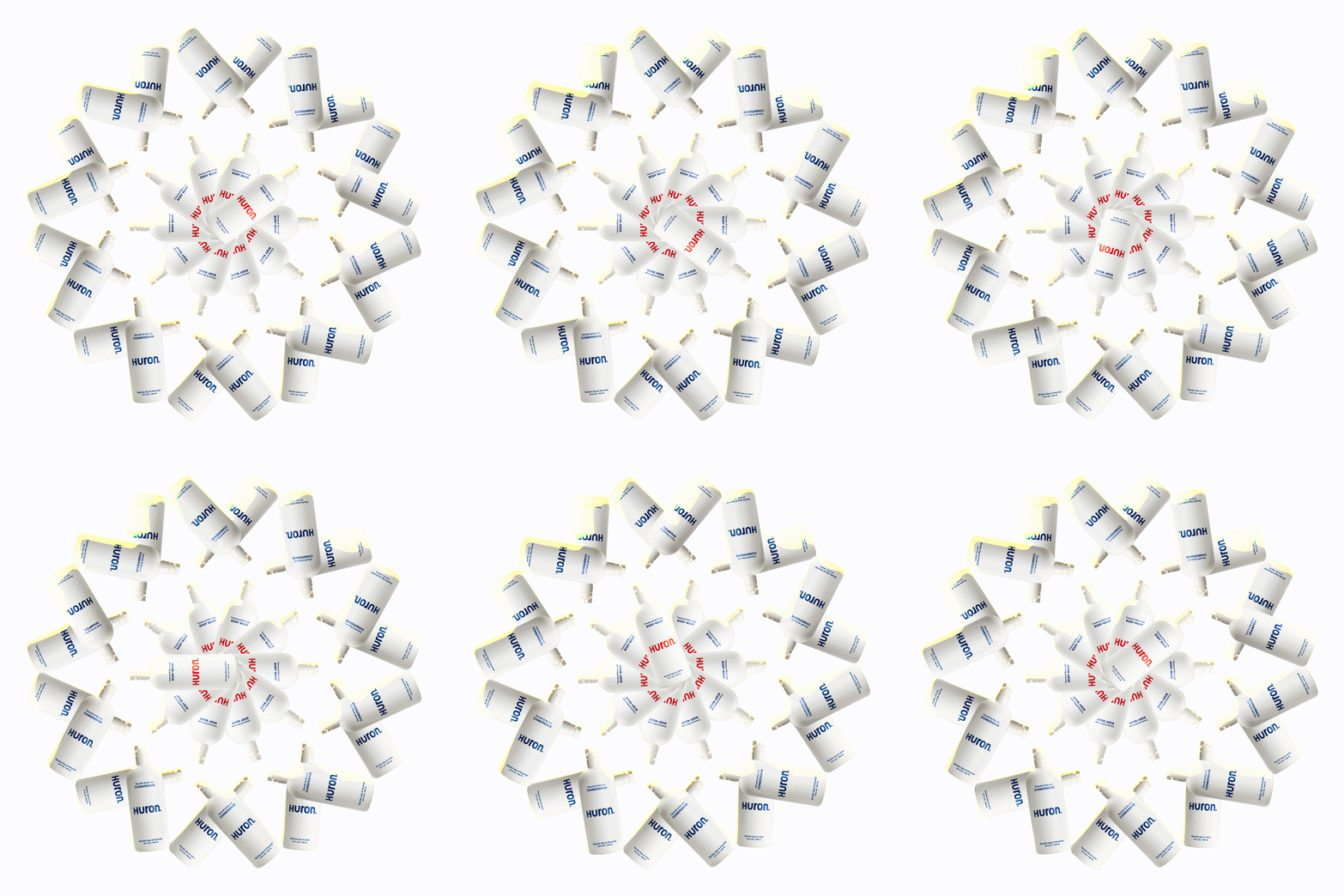
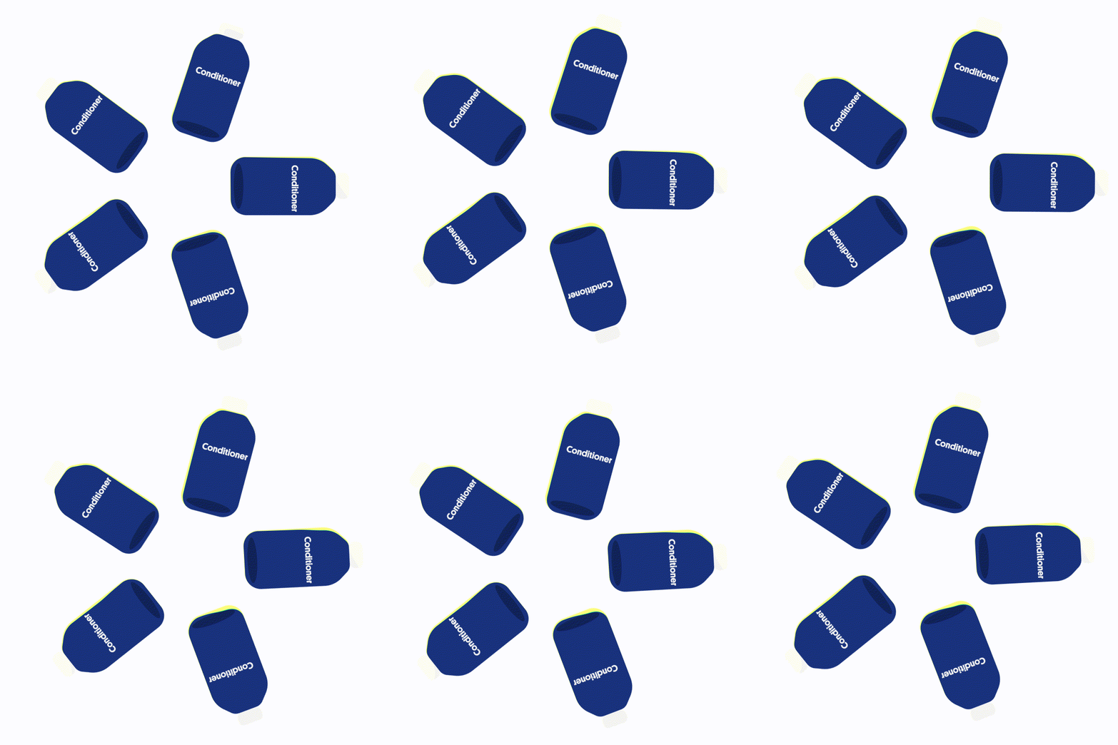
Loading GIFs:
I created custom loading icons for the Huron website and other related platforms. One of the icons (left) utilizes photoshopped, life renderings to create a chaotic and intricate icon. The other (right) is an illustrated GIF created using the app Procreate.
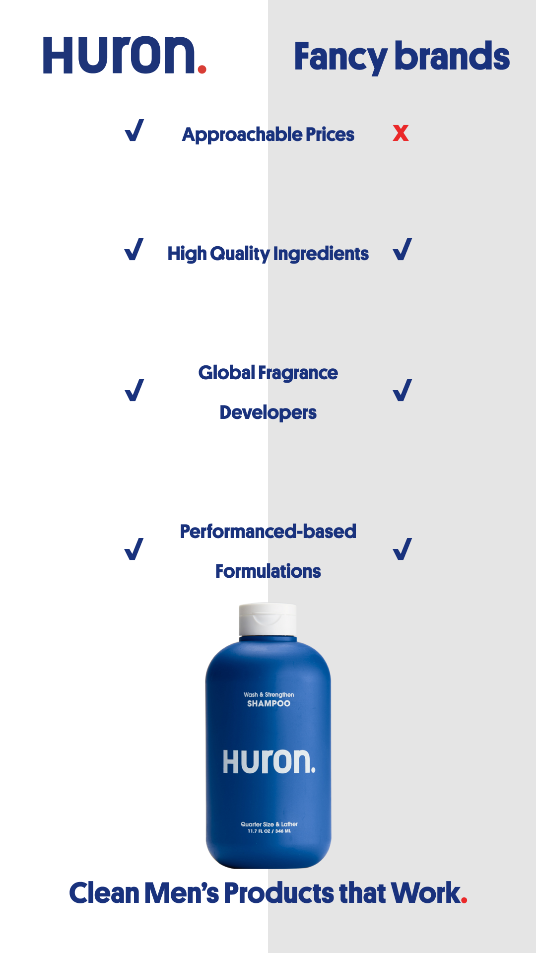
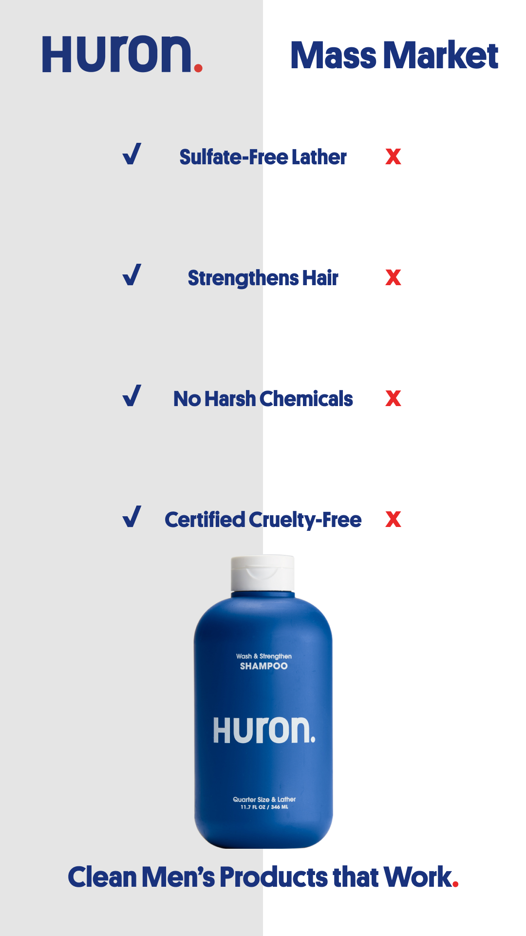
Competing Graphics:
I collaborated with the Lead Designer as well as the co-founder, Matt Mullenax. Here we created compelling graphics to creatively show off the advantages of this product.
Advertising Reels —>
Musical Postcards
Highlights and representations of musical elements designed using different elements within Adobe Illustrator
Tools: Adobe Illustrator
Time: WS23
EXIT Starseed Festival Poster Concept
Inspired by the Swedish design aesthetic, I have created a new look to this band’s, mouse rat, concert posters
Playing with different font spacings
Minimilist color palette
This logo design was inspired by a start up based on menopause.
The curvy, smooth exterior shape as well as the pale pink colors emphasize the female oriented nature of the company. The solid black font face elicits feelings of strength, and the curved line crossing through the “o” shows unity as it connects the beginning and end of the company name.
This logo design was inspired by a sleep company which uses a hardware device to detect sleep problems.
The line graph laid overtop of the name symbolizes the amount and quality of data available using the hardware device as well as shaped into the letters “a” and “w”. The opaque curved rectangle used to underlay the name condenses the letters together applying a modern edge to the logo.
This logo is used for an orchestral club at my school where a group of 7-12 high school musicians play classical as well as pop songs in small quartets for senior centers around Washington D.C.
This logo was hand made and drawn on an Ipad pro with an apple pencil using the app “procreate”. The first letter is cleverly replaced with a treble clef and the lower case “c” is replaced with a backwards bass clef sign. The top of the “h” and the two”l’s” are fitted with accent marks, further enhancing the musical theme. Finally, the background of the logo contains a monochromatic violin signifying that the club is made mostly up of string instruments.


